The color of the season, “Very Peri,” is bright and exciting and defined as a hue “whose courageous presence encourages personal inventiveness and creativity.” When used in interior spaces, this color can add a feminine, joyful, calm, powerful and futuristic sensation to your abode. However, these same qualities can have an overpowering effect on interior spaces if the color is not used in the right measure.

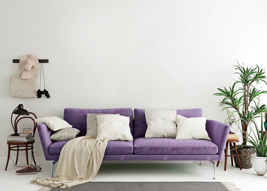
Very Peri is an intriguing blend between a soft blue and a fierce red. It combines the calmness of blue and the energy of red to get a cheerful, warm feel. It is reminiscent of lilac but carries more depth than that. It is light and breezy on the eyes and has a strange, soothing effect. It is a refreshing shade of blue which adds extra depth and calmness.
Here are five ways to incorporate “Very Peri” into your home:”.
- Use the hue on a specific wall or a niche as an accent to brighten up the interior experience.

2. Bring in that vibrant pop of color through cushions in hues of Very Peri, dotted on sofas and divans.

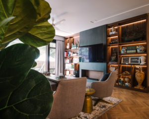
3. Use the color in upholstery for accent chairs, transforming them into stunning style statements.

4. Incorporate the color as elements in wallpaper design to add a bold and maximalist touch to your space.

5. Accessories your space with a rug, candle, vase, pillow, holder or ceramics to add a vibrant yet elegant look to the room.

Looking for more ideas to incorporate Very Peri into your home? Read more